|  
A website template is a generic, pre-designed
webpage. It was made months ago when
a graphic designer sat down and designed
a single homepage look/concept for
a generic business in some particular
industry, ready for someone to "fill
in the blanks". Then, it's put
out on the web for mass-download,
or sold cheaply as a "design"
by some "web design" firms.
These firms often don't warn you your
new design is a template. Others play-up
how easy it is to "pick-your-own"
design and get online cheaply.
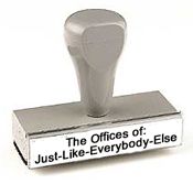
Website templates are very similar
to the rotating displays at novelty
stores. You've seen them - mini license
plates with a variety of different
first names.
The thought is that somebody who needs
a website can just choose from a menu
of designs they like. Once picked,
an intern or upstart designer can
just quickly fill in the blanks, populating
the site with info about that business.
You get a website for a suprisingly
low price, and viola! 
The Problem with Web Templates
#1:
"Hey, that's my shirt!"
You're not the only widget-seller
who chose that design. The two other
local dentists, the builder, the baker,
and the candlestick maker picked it
as well - and you've all been stamped
out from the same cookie cutter. So
much for original
identity and branding. A majority
of the inexpensive "website design
services" offered around the
web - maybe even one you're considering
- use just such methods.
The Problem with Web Templates
#2: "Your Honor, I Represent
Myself."
W ho, actually, is the expert here?
When was the last time your doctor
asked you what medication you'd like
today? Or "Save a bundle when
you pick your new home design from
our book". They don't tell you
you'll lose thousands moving your
toilet from the closet to the bathroom.
There are several hundred-million
websites out there (give or take a
handful). No speculation- it's proof
that people graze websites like cows
do grass - you've got literally 6
seconds to capture their attention
(and business). More people will visit
your website than you think, and the
web is a game of numbers.
 A
Fishing Net with Big Holes A
Fishing Net with Big Holes
You might sell to 350 of the 1000
people who walk through your actual
business door - a solid 35% conversion
rate. But online, selling to 50
out of 1000 visitors (5%) is
considered good.
Supreme attention to every minute
detail is what makes some websites
flourish while others falter. Perhaps
a single new customer is worth $100
to you. Landing 10 out of 1000 is
worth $900 more than 1 out of 1000.
Subtle influences in your
website's design will dictate that.
And when your site is seeing 1000
visitors a week? Selling to 9 more
means season tickets - for all sports
- in the skybox - and the parking
passes to match. Let's hope ya' didn't
skimp on the website design and miss
90% of the bounty you had
right in your net.
Do you know what those subtleties
are?
Well, you're not going to find any
such attention if your site is stamped
out from something that was designed
before you even met your web designer.
Simply put, custom
from-scratch website design has
a much higher conversion rate. Template
sites are full of holes that allow
the fish you land to fall right back
into the sea. Splash!
LimeDot has been building custom websites
since 1999. We've seen what works
and what doesn't. Countless
clients have found great success
from sites we've custom-designed for
them. This, and more, are automatic
inclusions in your new, custom
website design.
Heed Larry's warning above.
Say no to templates - and call LimeDot
today.
To
learn more, or for a free evaluation
of your project: |
 |
Call
LimeDot today at
404-424-9723 |
or |
 Use
our price
quote tool to provide
us with more details on
your project. Use
our price
quote tool to provide
us with more details on
your project. |
|
|